Artifacts gallery: three directions
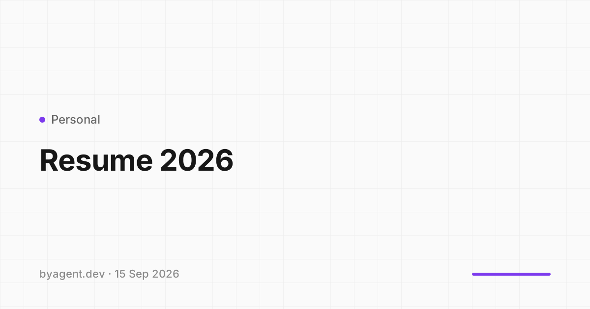
Same data in all three: recent artifacts get cover art (a Creatica background seeded by the artifact, title set on top like an OG image), grouped by day; everything older collapses into the list we have today, with a thumbnail. Project appears as a coloured dot plus name, tags as chips. Select any text to leave a note.
A. Bento
recommendedToday's newest artifact is the hero; the rest of the week fills a 4-column bento with one wide tile. Reads like a front page. Heights are fixed so the grid stays tidy regardless of how many artifacts a day has.
| Title | Project | Id | Comments | Published |
|---|---|---|---|---|
 Train refund single slot Train refund single slot | Hi Travel | KS50pl2e9Z8D | 2 | Sep 9 |
 Reason chips on the requisition card Reason chips on the requisition card | Hi Travel | oqeAObtxaXwC | 0 | Sep 7 |
| Distill #003 script | Distill | JFBTWnXNlVnJ | 3 | Sep 2 |
| Puzzle hub landing | Personal | 4ODygTs8n6BY | 0 | Aug 28 |
B. Masonry
Pinterest-style columns; covers keep their own aspect ratio (a cover can be landscape, square or tall, chosen from the generator). Feels editorial and dense; order runs down each column, so the newest item is not always top-left.

Older items: the same list as in A.
C. Uniform grid
The Vercel "projects" pattern: equal 3-up cards, strict chronological order, one section per day. Least surprising, easiest to scan, but no hierarchy: nothing says "this is today's big one".
Older items: the same list as in A.